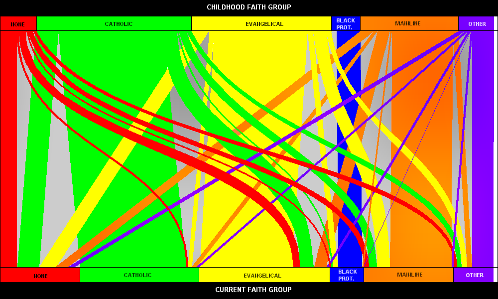
The folks at BRIN have been busy putting together this fab chart showing generational changes in religion in Britain. The data are from the 2008 British Social Survey and show the religion in which people were brought up on the left, and their current religion on the right. Connecting the two are ‘pipes’ showing how people have switched – the fatter the pipe, the more people have followed that path.
What jumps out immediately is that, ‘No religion’ is now the biggest category, as a result of large numbers of people switching out from Christianity. What this chart also makes obvious is that very few British people switch religions,. What switching there is seems to mostly be out of religion altogether.
What’s more, non-Christians almost all have stayed religious – very few have switched out to non-religion. I guess that’s because these people are mostly first or second-generation immigrants, for whom religion forms an important part of their cultural identity.
Now compare the UK chart with one done for the US by Internet Monk.
Some things are similar. Most notably, a lot of people have converted to ‘no religion’. Unlike the UK, however, some people move from ‘No religion’ into a religious group. That hardly ever happens in the UK, and perhaps reflects the social pressures on US individuals to be at least nominally religious.
In the US, there seems to be more switching in general, however. Unlike the UK, there’s noticeable switching from Catholic to Protestant (and vice versa), and even back and forth from ‘other’ religions.
I wonder why this should be?
 This article by Tom Rees was first published on Epiphenom. It is licensed under Creative Commons.


